




Murad
Murad
eCommerce ■ Experience Design ■ Experience Management
Index
A new digital look for Murad Italy
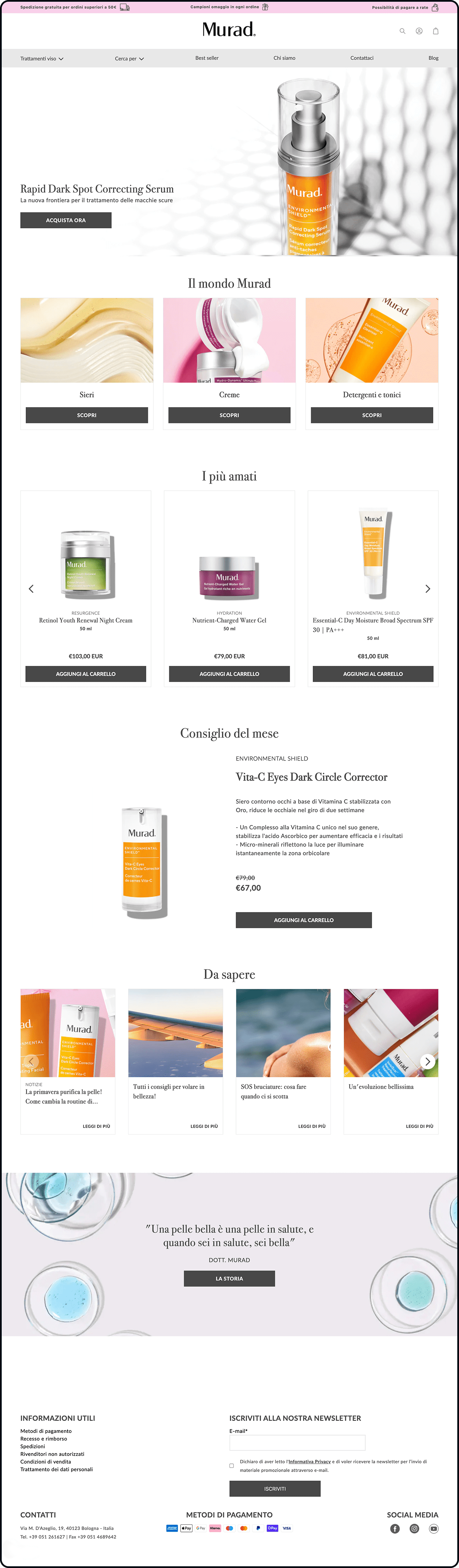
Murad, the first modern Doctor Brand, reaffirms its online presence by landing on Shopify with a revamped digital identity and immersive experience proposition.
Redesigning digital brand identity
The project was initiated with a one-day workshop at the client’s headquarters in Bologna, during which we investigated the current scenario and business expectations. The meeting highlighted the great potential of Murad, a premium product of the highest quality, much loved by customers who buy it in pharmacies or try it in beauty centers, whose strong identity that sets it apart, however, was failing to be reflected and enhanced in the current digital touchpoint.
Following the meeting with the client, we continued the research phase to delve into the digital as-is scenario, through usability tests by which we identified the main critical points and benchmark analysis of the target market, aimed at identifying best practices and identifying differentiating elements.
At the end of the research, we focused on the main areas of online focus that guided the subsequent redesign phase: the difficulty of transferring brand and product quality to the user in the absence of a figure of reference capable of promoting their value, the lack of classification by specific need, and weakly integrated brand storytelling in the navigation.
Murad's new eCommerce: an immersive experience between products and valuable content
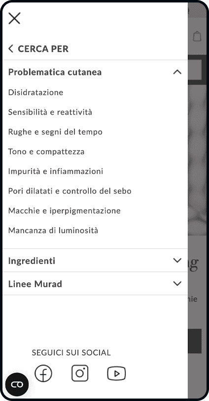
Based on the findings, we revised the information architecture of the shop by designing easy navigation for multiple needs, from product type to skin requirement to specific ingredient.
Having defined the architecture together with the client, we initiated the redesign of the site, customizing the experience guided by the evidence that emerged and enhancing the brand narrative and products through:
◼︎ Rich and comprehensive content for a complete brand experience immersive in premium product features
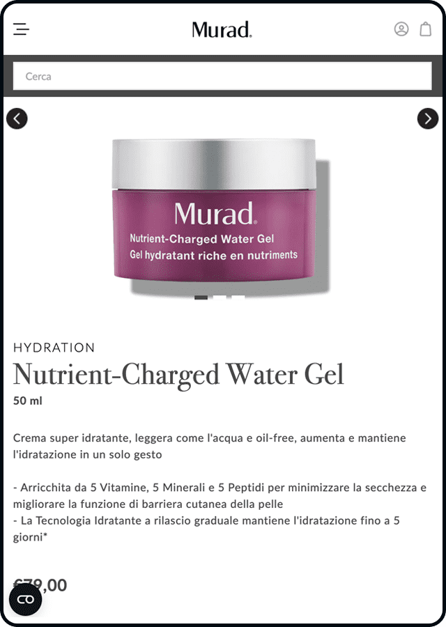
◼︎ A variety of product sheet templates to provide the user with the right information at the right time
◼︎ A reasoned content strategy from an SEO perspective to deliver interesting content that can bring value to the brand
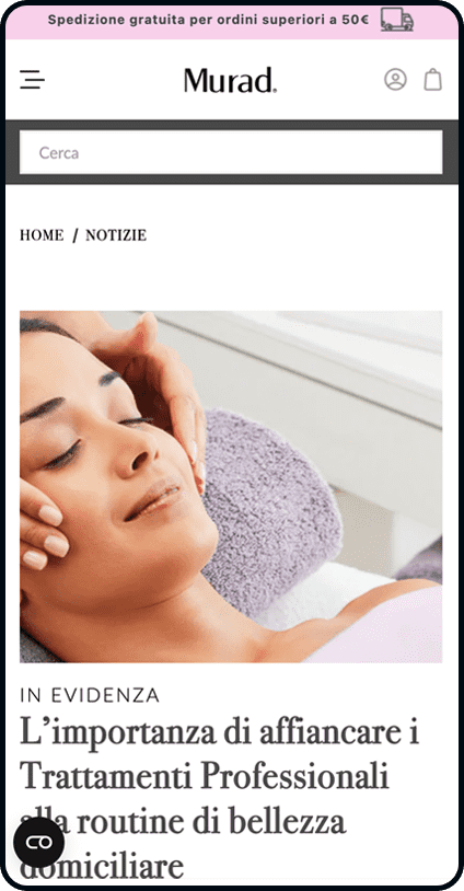
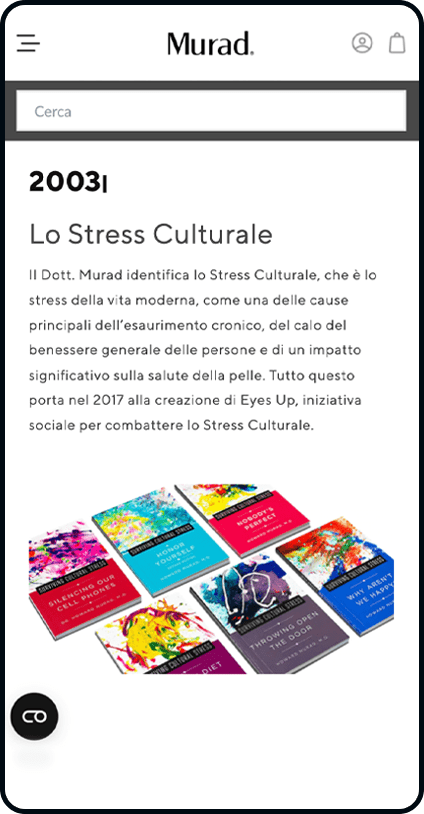
◼︎ An editorial design that provides fluidity of navigation between informational content and product search, while also giving visibility to the brand’s history and values
◼︎ A product search by specific need enhanced by efficient search
Shopify: ease of purchase and customization
We relied on Shopify for the site’s replatform to ensure a simple and intuitive shopping experience for all users on the one hand, and on the other hand to provide a customized brand experience through the use of the custom theme created by SpotView, stitched and adapted to the specificities of the brand and Murad customers.
Experience Automation for a user-friendly journey into the beauty world
Engaging new leads with personalized content to positively impact sales in Murad’s shop: this was the goal of our Experience Automation project, which in just four months generated results beyond expectations, including a +163% increase in the customer base enrolled in the newsletter and a +27% increase in revenue from newly activated email marketing streams.
Project
Experience Automation
Technology
Hubspot
Year
2022
Intrigue, engage, enthuse: 3 steps to win over the user
In the activity definition phase, we circumscribed together with the client the main weaknesses of the as-is and identified the objectives to be achieved for each stage of the funnel.
ATTRACT
Goal: optimize investment in adv
ENGAGE
Objective: to increase the database of profiled members and learn more about Murad’s target audience
DELIGHT & CONVERT
Goal: increase consideration, brand retention and purchase frequency
As part of a methodology that combines inbound and outbound marketing with actionable insights and targeted content strategy, we helped Murad understand and meet the needs of skincare lovers, accompanying them throughout the journey of getting to know and converting to the brand.
1. Attract
Activate engaging and interactive lead generation actions
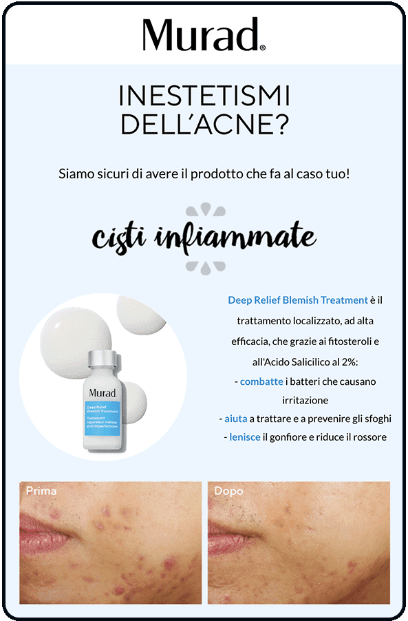
To make the lead generation campaign more engaging, we, together with the client, decided to create a skin quiz with a dual objective: to offer personalized beauty advice and to deeply understand the user’s preferences in order to tailor all future communications to their needs.

2. Engage
A personalized beauty routine for each user
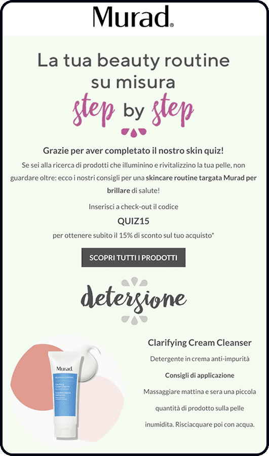
Once the users’ issues and needs were identified, we created a personalized beauty routine based on the test results for each user type: four steps for targeted skincare, along with dedicated beauty tips and a coupon for the user.
A journey to discover Murad
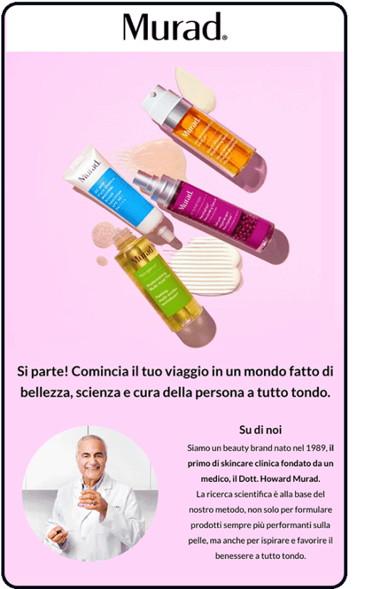
The onboarding process begins for the acquired lead: a four-email journey aimed at bringing the user closer to the brand, effectively balancing storytelling and the commercial offer. Starting with the story and differentiating factors of Murad, it continues with elements of social proof to quickly build trust and ends by challenging the user to test the products.
3. Convert & Delight
Increase retention with Experience Automation
The journey doesn’t stop and continues with personalized communications that are always valuable for the user: advice, routines, or beauty hacks tailored to the skin type, along with re-engagement actions based on the user’s behavior and preferences.

Results
Peak of conversions
Four months after the launch of the lead generation campaigns, the results achieved have been particularly satisfying:
◼︎ +72% revenue from the email channel
◼︎ +86% traffic from newsletters
◼︎ +27% total sales
Community growth
The activation of Experience Automation journeys from the acquisition phase has enabled rapid and significant community growth, reducing advertising campaign costs and supporting sales.
◼︎ 0,55€ CPL
◼︎ +163% new contacts
◼︎ 39% of users profiled in the database
(Period: 15 July 2022 – 15 November 2022)
Projects
Explore the digital products and services we have designed











Romina's
Romina's Beauty
eCommerce ■ eCommerce Management ■ Development ■ Experience Management ■ Design
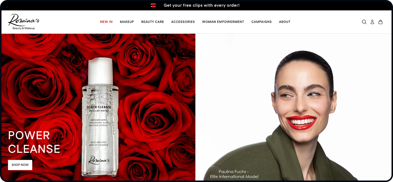
A new website that reflects a vision of beauty
Design and development
Choosing Shopify Plus as the eCommerce platform made it possible to combine scalability, fast development, and technological reliability—giving the brand a solid foundation to grow over time and expand into new markets with ease.
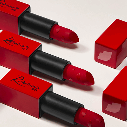
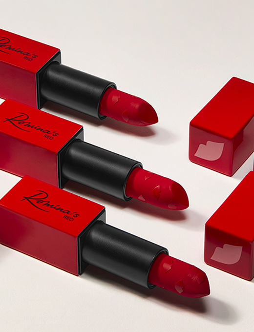
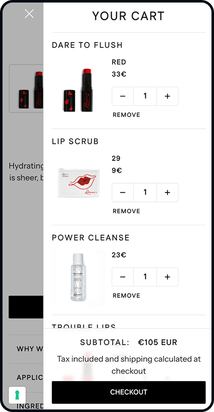
Red, Romina’s signature color, became the guiding thread of the design: an intense, bold shade symbolizing strength, passion, and confidence. Every element—from product page layouts to the information architecture—was crafted to turn the shopping journey into a memorable experience, fully aligned with the brand’s premium positioning.
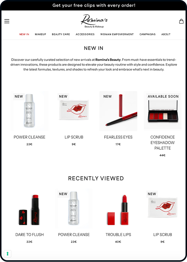
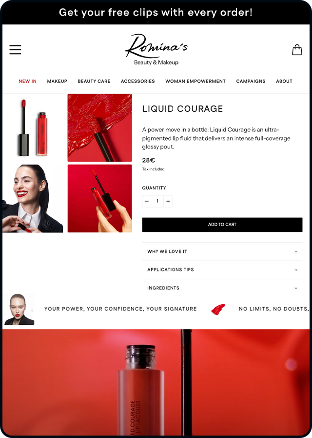
The product at the center

End-to-end management
In parallel with the design work, SpotView built a complete operational ecosystem capable of supporting Romina’s Beauty across every stage of its business. Through an eCommerce outsourcing model, we activated all essential services—from cross-border administrative and tax management to logistics, with an Italy-based warehouse and automated picking & packing processes.
We implemented a multichannel customer care service, meticulously shaped in tone, timing, and tools to meet the expectations of a premium audience. This integrated approach now enables the brand to manage sales, shipping, and customer support efficiently and at scale, maintaining full control over every touchpoint of the shopping experience.
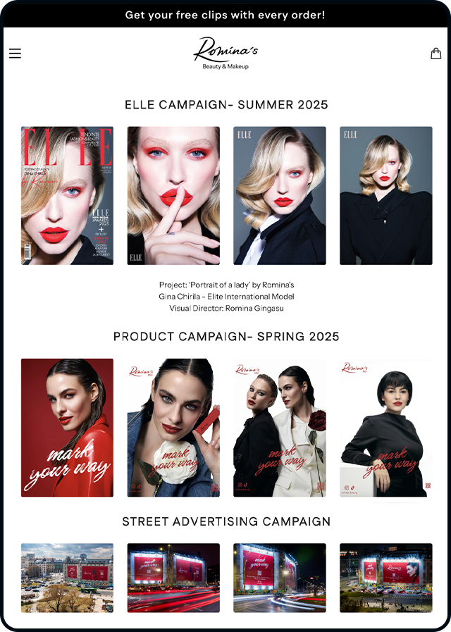
Alongside the new eCommerce platform, we support Romina’s with a targeted, ongoing editorial plan built on the integration between Klaviyo and a personalized content strategy. Every communication—from emails to seasonal campaigns—draws from the same visual and value-driven language of the brand, ensuring a consistent and recognizable narrative across every touchpoint.
The email marketing strategy becomes a natural extension of the online experience: carefully crafted messages and inspirational storytelling that speak directly to the needs and aspirations of customers. A strategy that nurtures an authentic relationship, strengthens the community, and supports the brand’s long-term growth.
Content strategy
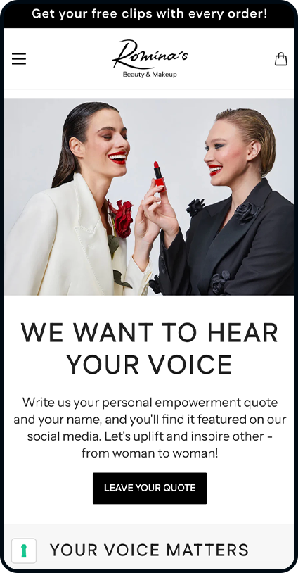
The result
Projects


Farmacie Vigorito
Farmacie Vigorito
eCommerce ■ Experience Design ■ Experience Management
A New eCommerce ecosystem to master pharma complexity
The Farmacie Vigorito project was born from the need to move beyond a legacy eCommerce platform that had become a bottleneck for both business growth and operational autonomy. The challenge was high-stakes but familiar to the pharma world: orchestrating a vast product range and strict compliance standards within a complex supply chain fed by both internal and external providers.
Our goal was to engineer a digital ecosystem that absorbs backend complexity without compromising the fluidity of the customer journey. We built a high-performance engine where total control, seamless scalability, and operational agility work in perfect sync.

Platform redesign
We kicked off by reimagining the entire tech stack, choosing Shopify Plus to anchor a more efficient, future-ready eCommerce experience. This transition allowed the brand to move beyond the bottlenecks of their legacy system, granting the team full creative autonomy through Shopify’s intuitive tools and a far more fluid editing experience.
At the heart of the project was the challenge of scale: managing a massive catalog of 150,000 products. To turn this volume into a competitive edge, we deployed a mix of standard and bespoke integrations:
-
Farmadati Connector: For seamless, automated product data enrichment.
-
Fulk Integration: To power the storefront with high-definition visual assets.
-
Automated Workflows: Intelligent categorization and dynamic page-templating based on product type.
Multi-warehouse logistics & smart pricing strategies
A core challenge of the project lay in synchronizing a multi-layered logistics and pricing model. While Farmacie Vigorito stocks a curated portion of the catalog, the bulk of their offering is fulfilled through a network of third-party wholesalers.
To bridge these two worlds, SpotView engineered a marketplace-inspired dynamic pricing engine designed to:
-
Prioritize In-House Inventory: Automatically favoring products available in the client’s own warehouse to optimize margins.
-
Automated Markup Logic: Instantly calculating final prices by applying intelligent markups to wholesaler rates whenever internal stock is unavailable.
-
Unified Customer Experience: Ensuring total consistency and a frictionless journey, regardless of where the product originates.
This architecture empowers the brand to scale its assortment without losing a shred of control over pricing or fulfillment.
A tailored shopping experience for the pharma consumer
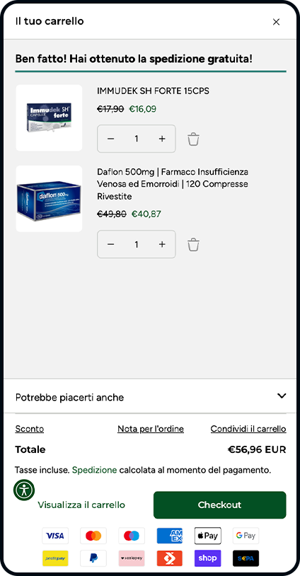
In addition to the backend work, we led a user-centric evolution of the storefront, ensuring every step of the customer journey is clear, guided, and intuitive.
Key enhancements include:
-
Custom-Engineered Checkout: A bespoke process tailored to pharmaceutical needs, including seamless tax ID (Codice Fiscale) integration for medical deductions.
-
Automated VAT Compliance: Leveraging Shopify Flow to automate reduced VAT rates (4%) on eligible products, ensuring accuracy without manual friction.
-
Loyalty & Retention: A strategic loyalty program integrated via third-party apps to drive repeat purchases and increase customer lifetime value.
-
Smart Shipping with Kapla: Full integration for multi-carrier logistics management and real-time shipment tracking.
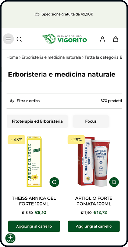
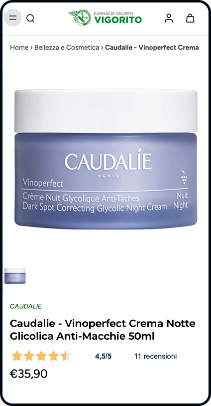
The product pages were also completely reimagined. We introduced dynamic templates that adapt to the product type—whether OTC drugs, premium beauty, or general healthcare items—creating a leaner, more informative layout that prioritizes clarity over clutter.
UI, content & discovery
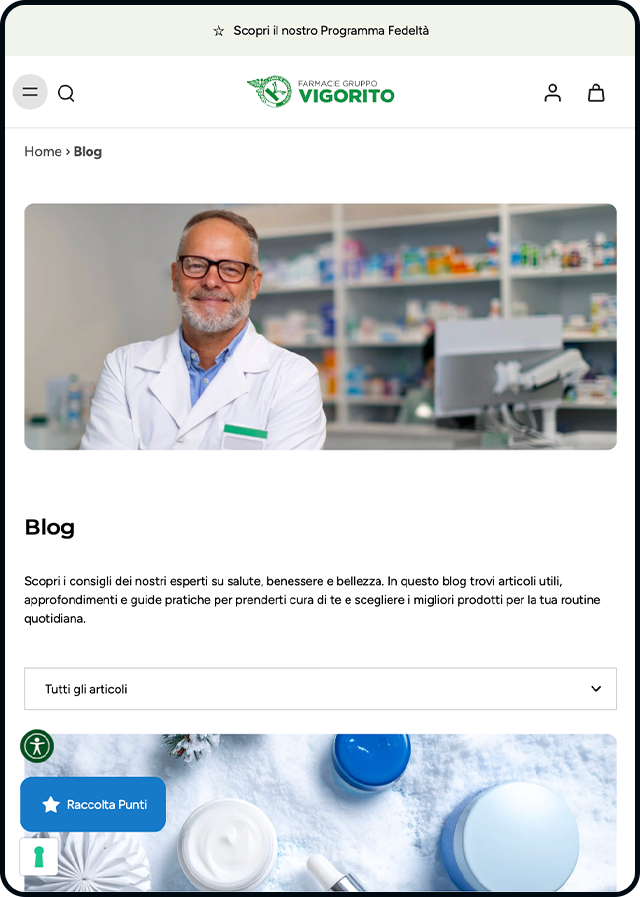
The user interface underwent a complete experience redesign, crafted to highlight more than just the product catalog. The new portal strikes a balance between high-conversion shopping and editorial storytelling, showcasing the brand’s unique value proposition.
To streamline the content experience, we migrated and restructured the Blog, eliminating fragmentation through a cleaner, more intuitive categorization system.
To power the discovery phase, we integrated Doofinder as the internal search engine. The tool was finely tuned with custom display rules, ensuring that search results align perfectly with the unique logic of the pharmaceutical catalog.
Results
-
A scalable eCommerce powerhouse: A high-performance platform engineered to master massive catalogs and complex multi-warehouse logistics while delivering a frictionless shopping experience.
-
Operational independence: Greater agility for the internal team, who can now manage the storefront and editorial content with total autonomy through Shopify’s streamlined tools.
-
A future-ready ecosystem: A robust digital foundation primed for growth, with the flexibility to integrate advanced loyalty programs, recurring purchases, and deep personalization.
Projects
Explore the digital products and services we’ve designed.

Alfaparf
Alfaparf
eCommerce ■ Experience Design ■ Experience Management
From B2B to B2C: the new Alfaparf eCommerce experience
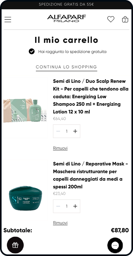
Alfaparf, Italy’s leading professional beauty company, has embarked on a digital transformation journey. The goal was to evolve its long-standing B2B model into a premium B2C experience tailored directly to the end consumer.
We partnered with the brand to optimize their existing Shopify Plus Italian store, refining the architecture, customer experience, and content strategy. Our mission was to elevate the group’s diverse brands while making professional-grade products more accessible to the general public. While the project launched in Italy, it was designed from day one with global scalability at its core.
A scalable ecosystem for a multi-brand powerhouse
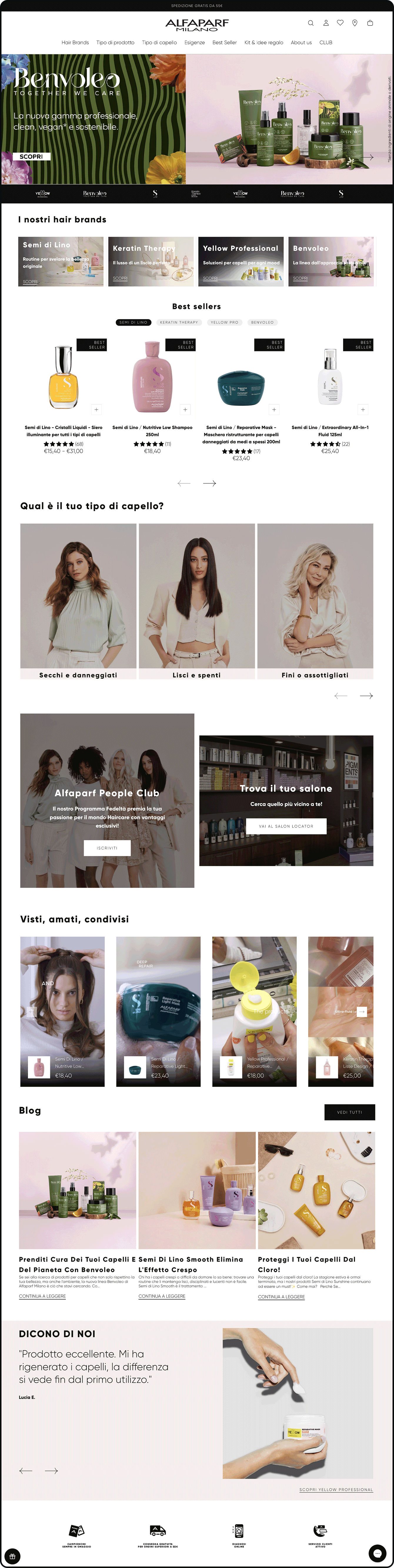
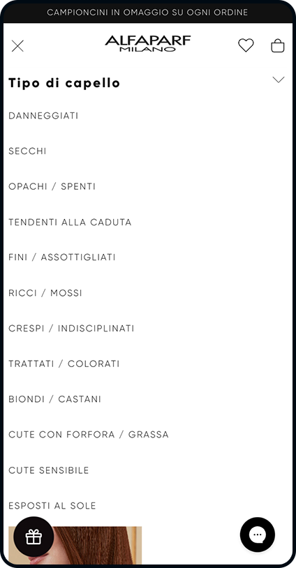
Managing a portfolio of diverse brands means balancing unique visual identities and creative guidelines. The challenge was to build a platform that could preserve the distinct personality of each brand while maintaining a cohesive, recognizable digital experience for the entire group.
To support Alfaparf’s international growth, we established a scalable technological framework that allows the eCommerce model to be seamlessly replicated across different markets.
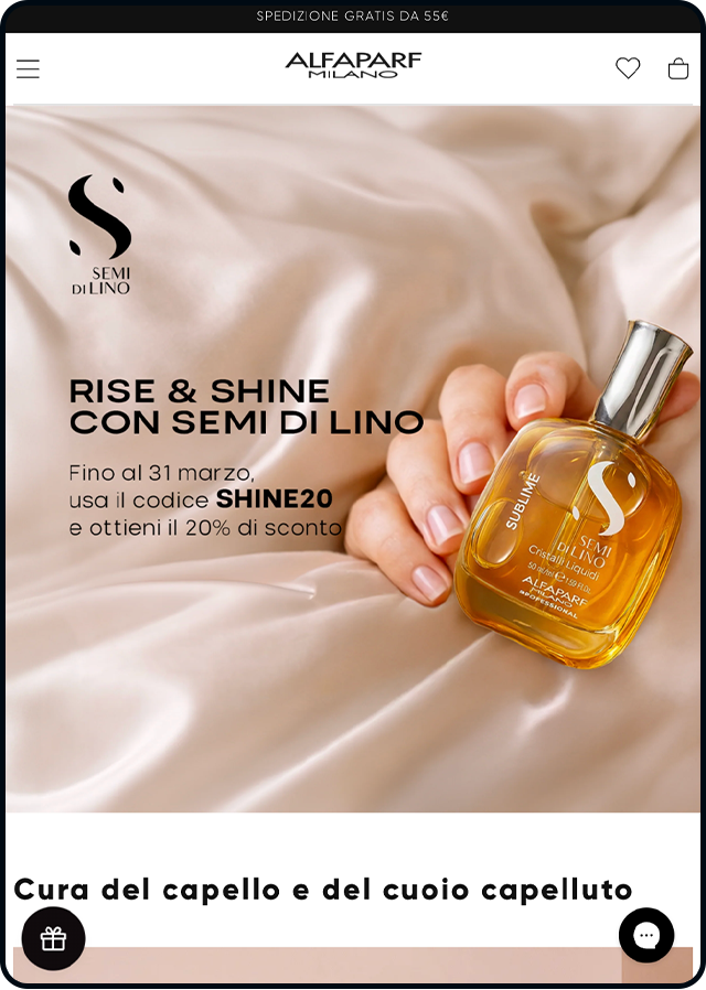
We designed dedicated brand pages to showcase individual identities through immersive storytelling. Additionally, we leveraged Custom CSS to tailor the UI to specific user experience needs, all while maintaining the robust technical foundation of Shopify Plus.
An expanded and cohesive catalog
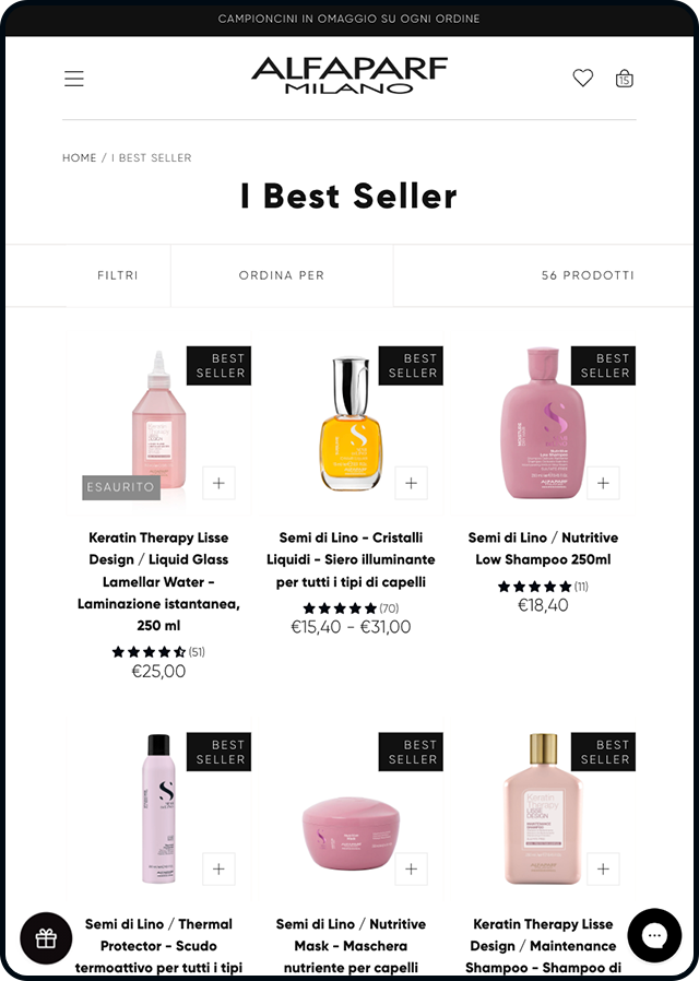
One of the core elements of the project was managing an incredibly vast catalog of approximately 150,000 products.
To achieve this, we implemented a mix of standard and custom integrations, including:
-
a Farmadati connector for seamless management and enrichment of product data sheets;
-
integration with Fulk to ensure the use of high-quality imagery across the site;
-
automated workflows for product categorization and the dynamic assignment of page templates based on product type.
Built for global growth
The platform was developed on Shopify Plus using a multi-store architecture powered by Expansion Stores.
The optimization of the Italian store served as the blueprint for all future local markets. This foundation will be used to roll out Expansion Stores globally, ensuring visual and functional consistency while allowing for country-specific adaptations. This approach empowers international expansion through a unified, high-performance tech stack.
Content and storytelling at the heart of the journey
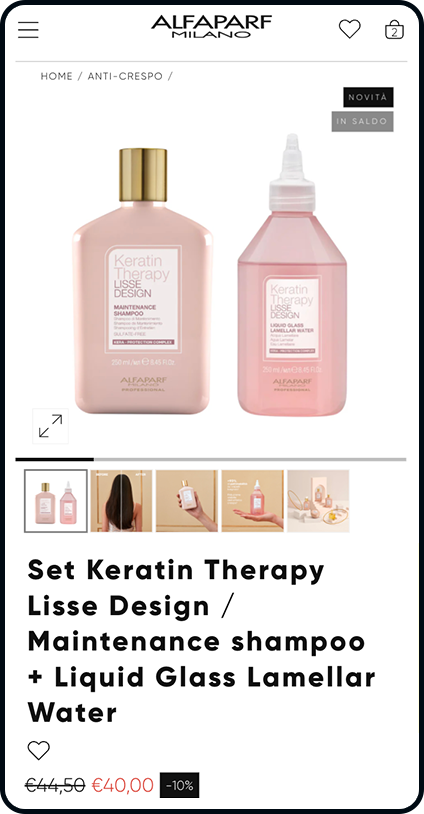
We transformed the product pages by introducing rich, educational, and multimedia content to guide users through their shopping journey.
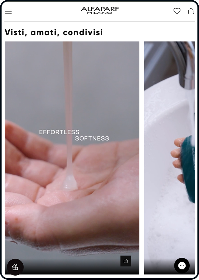
By incorporating “Before & After” visuals and informative materials, we helped customers better understand product benefits and professional results. Moreover, we bridged the gap between social media and the web store by syncing on-site videos with the brand’s social channels—creating a truly seamless, omnichannel brand experience.
Loyalty and Engagement
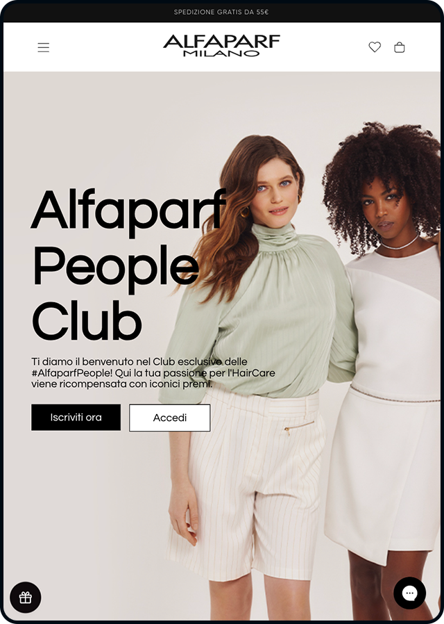
The platform places a spotlight on the Alfaparf People Club, the brand’s loyalty program which boasts over 6,100 active users.
Integrated deeply into the digital experience, the program strengthens customer relationships and simplifies the path to purchase. By providing tailored information and expert guidance, it helps users confidently choose the products that best fit their personal beauty needs.
Projects
Explore the digital products and services we have designed
Kimbo
Kimbo
eCommerce ■ Experience Design ■ Experience Management
The new digital store of Naples coffee
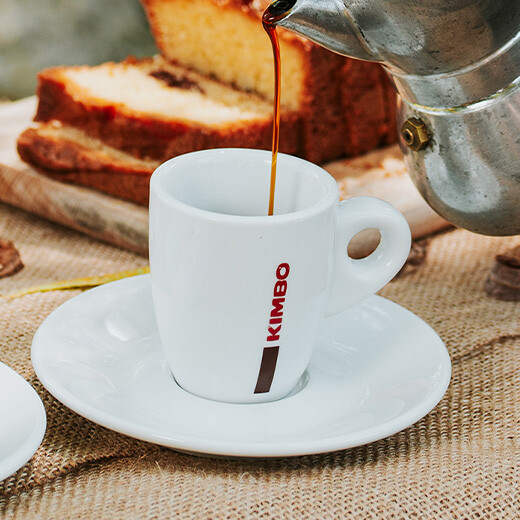
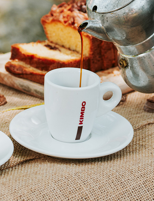
Kimbo’s identity is inextricably linked to its city, Naples, and to the values of the Neapolitan way of life that it represents in the world: beauty, culture, and tradition, encapsulated in the ritual of meeting in front of a coffee. Our main challenge was to transfer this constellation of meanings into a digital ecosystem that goes above and beyond the actual product to express an ideal of life.

From old to new: replatforming and redesign
The project started with the migration of the catalog from the previous shop (on a Magento 2 platform) to a new Shopify Plus eCommerce. Following a discovery workshop with the client in which we investigated goals and expectations, we started an in-depth analysis to build a scalable, powerful and flexible solution from a performance point of view. We also wanted it to be effective and engaging, thanks to the strategic levers and the User Experience we proposed. Replatforming involved not only the migration of eCommerce data and order history, but also that of SEO content, and the redirect of urls, to maintain the search engine ranking earned over time by the pages.
Care for experience, care for relationships
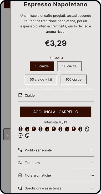
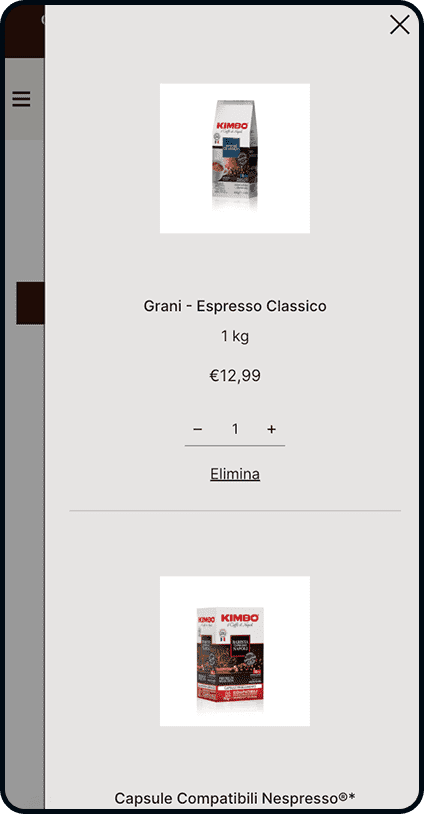
The UI underwent a radical redesign that prioritized the enrichment of the user experience through the integration of functional and editorial content. The fundamental components of an eCommerce storefront, the product sheets, were redesigned to enhance and promote the whole world that revolves around coffee, adding dynamic sections that link to thematic insights.
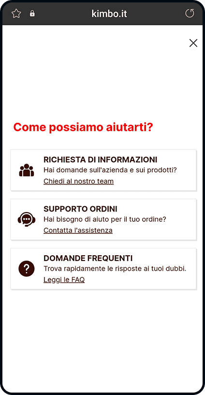
Great attention was also given to customer relations, through the creation of a widget integrated with Klaviyo to facilitate contact with Customer Service. Always accessible through a floating icon, the widget presents itself as a first point of access that can guide users to the most suitable support path for their needs, from FAQs to opening different types of tickets.
On the user's side with Zendesk
The attention devoted to the usability of the site finds its completion in the analysis and reshaping of Customer Care processes even outside of the website navigation. The tool chosen is Zendesk, an omnichannel and flexible solution employed to manage the tickets opened by users and to generate reports in order to constantly improve the level of service offered.
Let the brand do the talking: institutional communication
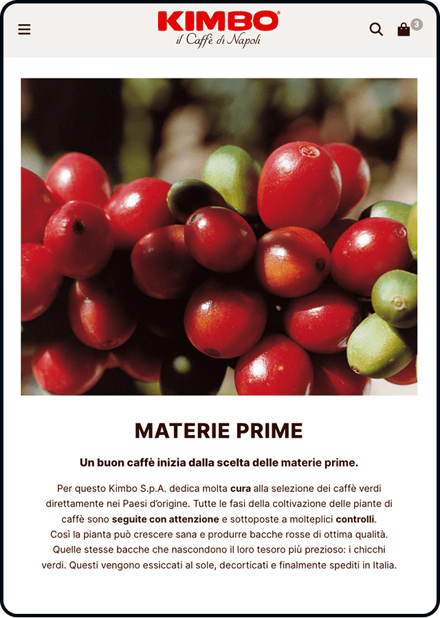
An iconic brand like Kimbo has many stories to tell. This is why we have built a rich and articulate editorial section dedicated to telling the story of the company and communicating its initiatives, from those dedicated to sustainability efforts to cultural and artistic collaborations. The site also hosts a blog, which features articles and curiosities related to the Kimbo world and coffee.
Promoting growth with Klaviyo
Data collection and analysis on interactions with the shop is managed through Klaviyo. This powerful marketing automation platform enables highly refined segmentation of audiences into clusters, in order to build tailored workflows with customized content and dedicated discounting.
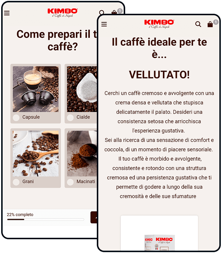
We also run data enrichment campaigns through Klaviyo to collect, in an interactive and engaging way, information about user preferences. A quiz on the homepage helps people discover the type of coffee that best suits their tastes, immediately presenting personalized purchase suggestions. As a result of these strategies, each visitor is offered a tailored experience, increasing the likelihood that he or she will turn into a loyal user.
Projects
Explore the digital products and services we’ve designed.
Pasta Armando
Pasta Armando
eCommerce ■ eCommerce Management ■ Development ■ Experience Management ■ Design
From tradition to digital: a branding website showcasing Italian excellence
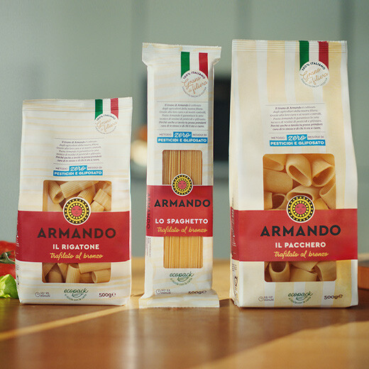
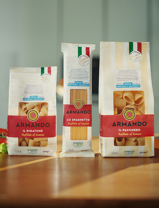
Pasta Armando was born from a clear promise: 100% Italian pasta, the result of a short and certified supply chain. The brand needed a website capable of conveying its core values while strengthening its leadership in the premium pasta market.

Strategy
SpotView approached the project with a user-first mindset: every design choice was guided by the goal of crafting a clear, authoritative, and memorable story.
Branding as the core driver
The new website was conceived not as a simple eCommerce platform, but as an editorial space designed to express Pasta Armando’s identity, values, and culture.
A story of the supply chain
We highlighted transparency and control over the entire production process through content that takes users on a journey from field to table, turning every detail into part of a story about quality.
A solid and inspiring user experience
A clear structure, smooth navigation, and consistent design make the experience both intuitive and content-rich — reinforcing trust and brand recognition.

Solution
The new Pasta Armando website now features:
- A narrative homepage that immediately conveys the brand’s unique positioning.
- Dedicated sections highlighting the certified short supply chain, enriched with visual storytelling and editorial content.
- Premium product pages that combine comprehensive information with refined aesthetics.
- A content ecosystem designed to boost brand awareness and nurture the relationship with consumers.
- A tech infrastructure built on Shopify, chosen for its robustness, scalability, and seamless integration with other marketing tools.
- Custom solutions: starting from a Shopify theme, we shaped it around the brand’s specific needs, introducing tailor-made components and micro-interactions that enhance Pasta Armando’s identity and deliver a truly bespoke experience.

Recipes and influencers
We created an editorial hub that showcases not only Pasta Armando’s original recipes but also contributions from chefs and influencers who choose the brand’s quality for their creations. This section serves as a bridge between tradition and modernity — inspiring the community and, together with the supply chain content, strengthening the relationship with an increasingly engaged and mindful audience.


Email marketing
To support the growth of the new website, we developed an email marketing strategy integrated into Shopify through Klaviyo. The goal was clear: to turn email from a simple promotional channel into a powerful tool for engagement and conversion.
The platform allowed us to guide new users through a welcome journey introducing brand values, products, and tasting boxes — while recovering potential sales through automated reminders for abandoned carts and checkouts.
Thanks to the integration with media platforms, data collected through newsletters and purchases are used to build personalized audiences. This enables more targeted communication across user segments, enhances targeting and retargeting activities, and makes digital campaigns more efficient and scalable.
The results
Today, Pasta Armando doesn’t just have a website — it has a digital hub that embodies its identity, elevates its content, and strengthens its connection with consumers.
Progetti
Esplora i prodotti digitali e i servizi che abbiamo progettato

Tucano Urbano
Tucano Urbano
eCommerce ■ Experience Design ■ Experience Management
An immersive experience for the urban rider
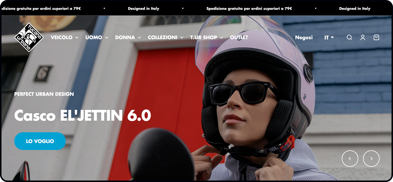
Tucano Urbano, a leading brand in urban motorcycle apparel and accessories, set out to deliver a digital experience that mirrors its identity—immersive, functional, and deeply attuned to the needs of the modern rider.
The new website, built on Shopify Plus, puts content quality and product detail pages at the heart of the experience. Rich in information and enhanced with images, videos, and reviews, these pages are designed to guide users through their purchase journey, immersing them in the real-world experience of each product.
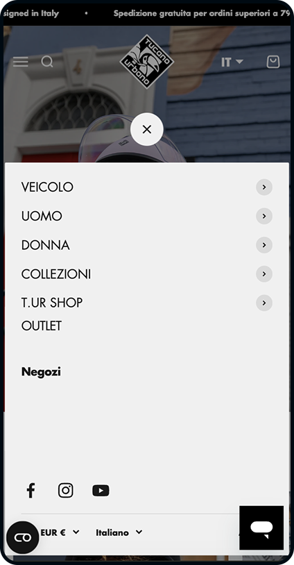
An integration with an advanced vehicle search tool allows users to view only the accessories compatible with their specific motorcycle model, making navigation simpler, more useful, and fully personalized.
The challenge
Tucano Urbano needed to move beyond the constraints of a rigid eCommerce platform that was ill-suited for growth. The existing system hindered autonomous content management, slowed down the checkout process, and failed to deliver a user experience that matched the brand’s standards.
Adding to the challenge was a strategic objective: to merge two distinct identities—Tucano Urbano and TUR—into a single, cohesive digital ecosystem that would be high-performing, consistent, and unmistakably recognizable.
The solution
We developed a modern, versatile eCommerce platform that puts the user experience front and center, with a strong focus on content and personalized shopping journeys enabled through a range of tailored implementations.
Vehicle-Based Search Engine
An innovative tool that allows users to select their specific motorcycle model and view only the compatible accessories—greatly simplifying the search and purchase process
Persistent compatibility widget
A dynamic widget that “follows” the user throughout their browsing journey, allowing them to check accessory compatibility with their vehicle at any time—without needing to navigate back or interrupt their experience.
Integrated Customer Support
Seamless integration of a multilingual Zendesk chatbot—available in five languages—to assist with purchases, provide post-sales support, track orders, and offer detailed product information.
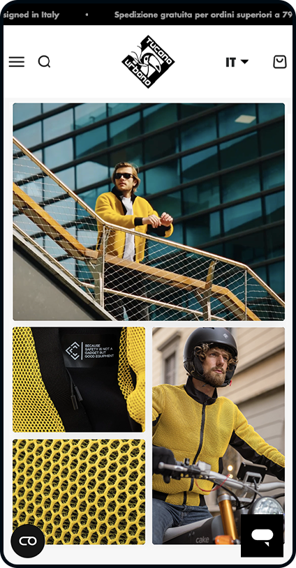
Premium product pages
We crafted product pages packed with rich multimedia content:
-
High-resolution image mosaics
-
Demonstration videos
-
In-depth customer reviews
-
Comprehensive technical specifications
These elements allow customers to envision the product in use even before purchasing, elevating both storytelling and the experiential dimension of the shopping journey.

Klaviyo integration
We integrated an advanced email marketing system powered by Klaviyo, designed to enhance communication personalization and boost conversion rates.
By collecting and analyzing behavioral data, every message is precisely tailored—from dynamic user segmentation to automated funnel creation, all the way to targeted campaigns triggered by specific actions (purchases, browsing patterns, interests).
The goal? To reach the right customer, at the right time, with the most relevant content.
The results
The new eCommerce platform has delivered significant improvements across key areas:
-
User Experience: A smoother, more personalized shopping journey that aligns with user expectations.
-
Operational Efficiency: A more intuitive CMS that simplifies daily platform management.
-
Brand Identity: Greater visual and communicative consistency between the two brands.
-
Customer Satisfaction: A notable reduction in support requests, thanks to clearer, more accessible product information.
“Working with SpotView allowed us to elevate our digital presence. The new eCommerce platform is not just a sales tool—it’s a true communication channel with our customers, perfectly reflecting the values and identity of Tucano Urbano.”
Florian Martin, Marketing Manager Tucano Urbano

Projects
Explore the digital products and services we have designed

Benu Farma
BENU Farma
eCommerce ■ Experience Design ■ Performance ■ Experience Management ■ Marketplace
As part of BENU Farmacia’s digital transformation journey, we designed and developed two complementary strategic initiatives: the complete overhaul of the eCommerce platform and the subsequent launch of the BENU Marketplace.
We began by redesigning the purchasing experience and technical infrastructure on Shopify Plus, aiming to create a high-performance, scalable, and conversion-oriented digital ecosystem. Building on this foundation, we then developed the Marketplace, integrating Mirakl with Shopify Plus. This integration evolves the traditional eCommerce model by opening the platform to selected third-party sellers, ultimately strengthening the brand’s market positioning and digital presence.
Index
An ecosystem designed to drive conversions
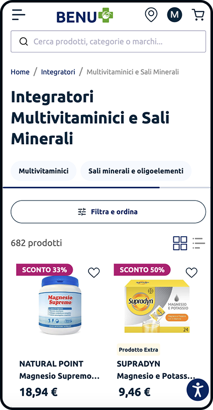
Based on the insights gathered, we initiated a complete interface redesign, starting from a robust wireframe foundation to ensure a smoother, more intuitive user experience aligned with the brand’s positioning.
Key improvements included:
-
A new menu and navigation system, designed to be more intuitive and engaging
-
An enhanced discovery experience, enriched with editorial and visual content to support product and brand exploration
-
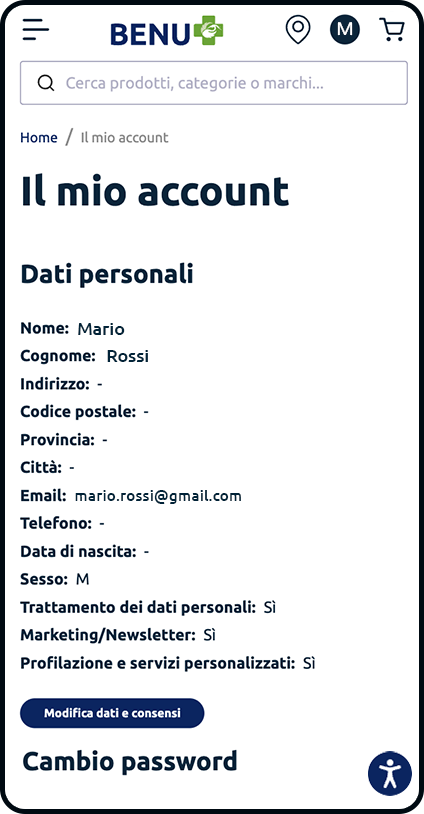
Improvements to the personal area and increased visibility of the loyalty program
-
Creation of reusable landing pages and components, giving the client’s team greater editorial flexibility and independence
-
A revamped product detail page, reorganized and enriched with custom labels to highlight key assortment features
-
A restructured promotions section, designed to guide users seamlessly through commercial offers

Shopify Plus and headless architecture
Shopify Plus remains the powerhouse at the core of the eCommerce infrastructure, ensuring high reliability, scalability, and performance. To enable more advanced optimization, the project adopted a headless architecture that decouples content management from the transactional engine. This approach allows for more granular and sophisticated performance control, with a strong focus on indexing and SEO logic—both essential for visibility and organic growth.
While Shopify handles all eCommerce operations, content across all other touchpoints—from the main site to the blog and even digital totems—is managed via Strapi, a headless CMS platform that offers flexibility, control, and consistent storytelling across every channel.

Personalization and relevance: the keys to success
We designed a tailor-made digital ecosystem where every detail strengthens the bond between brand and customer. The custom-built logic enables smart activation of coupons and promotions linked to the loyalty program, fully integrated with the CRM and capable of displaying personalized vouchers based on the user’s loyalty card.
To further enhance the shopping experience, we implemented advanced use of Algolia. Beyond optimizing search result relevance, it introduces sophisticated recommendation logic based on user behavior, preferences, and purchase history. A powerful way to turn search into discovery—and shopping into a seamless experience.

360-degree digital support
Spotview is in charge of managing the online presence of BENU Farma: from strategic consulting and support for digital transformation projects to the management of online advertising campaigns on digital channels, and everything related to eCommerce operations: content creation and web design, digital analytics, CRM management, and support for the reorganization of multichannel customer service on a Zendesk basis.
Results
In just three months from the go-live, Benu Pharma’s digital performance recorded significant growth compared to the same period of the previous year. Transactions increased by +90%, driven in particular by mobile, which recorded a +79% rise. The conversion rate grew by +33% (+10% on mobile), a clear sign of a smoother and more effective user experience. Engagement also showed positive signals, with page views per session up by +18% (+15% on mobile). A result that confirms how strategy, technology, and focus on customer experience can turn into a tangible competitive advantage
From eCommerce to Marketplace: The Evolution of the BENU Digital Platform
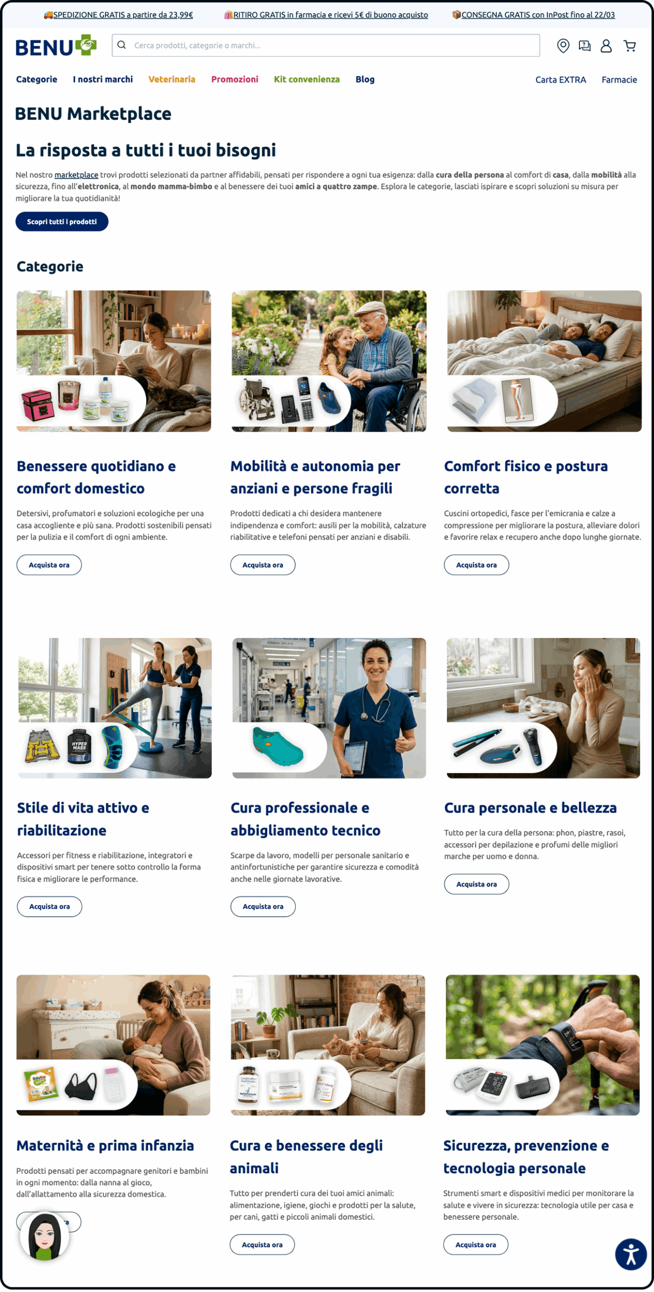
Following the successful overhaul of its eCommerce platform, BENU Farma’s digital evolution continues with the launch of the BENU Marketplace. This new digital space seamlessly integrates the brand’s proprietary catalog with products offered by third-party sellers.
The project introduces a versatile model where vendors can either list entirely new items or provide competitive offers on products already featured in the catalog. Throughout this expansion, BENU maintains full oversight and control over the platform’s governance and operational standards.
Project Objectives
The marketplace was introduced to extend the existing online sales model and drive the strategic growth of the digital channel.
Key objectives included:
-
Generating new revenue streams through selected partnerships.
-
Expanding the product catalog to offer a wider assortment.
-
Increasing customer retention and purchase frequency.
-
Strengthening BENU Farma’s digital positioning and market presence.
The Marketplace Platform
To manage the operational logic of the marketplace, we selected Mirakl, the platform that enables BENU to define the ecosystem’s governance and functional rules.
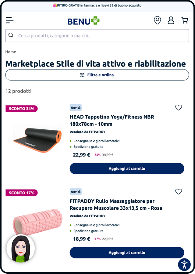
Through Mirakl, the system manages seller profiles, new product uploads, and the publishing of offers on items already existing in the catalog. Furthermore, the platform governs order routing and the distribution of shipments across different vendors.
The architecture supports multiple sellers for the same product, allowing each to offer unique pricing and commercial conditions.
Technological Integration: A Next-Generation Connector
We built the marketplace by integrating Mirakl with Shopify Plus through a next-generation connector. BENU was among the first European merchants to adopt this integration, which enables seamless order retrieval between the two platforms.
The project required extensive customization of the integration and front-end refinements, as well as the implementation of the proprietary offer management algorithm. Since the connector was a relatively new solution, our work also focused on identifying functional gaps and defining the precise scope of the processes to be integrated.
We collaborated closely with both Mirakl and the BENU team to optimize the connector based on specific operational requirements, extending its features through custom development.
Checkout and Shipping Logic
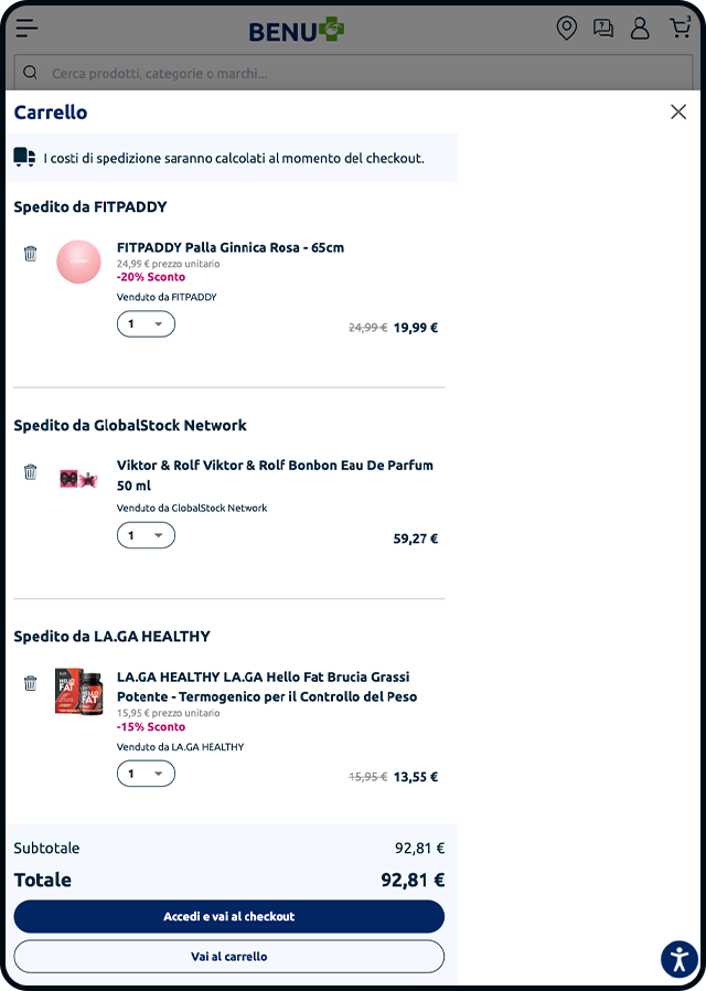
A significant part of the project focused on integrating marketplace functionalities directly into the Shopify checkout experience.
We implemented custom solutions using dedicated apps and Shopify Functions/Extensions to optimize checkout behavior. This ensured full compatibility between marketplace products and BENU’s existing shipping methods, including the strategic “Click & Collect” service for delivery to the group’s brick-and-mortar pharmacies.
Payments and Financial Workflow Management
To support the marketplace operations, we introduced Mollie as the Payment Service Provider. This platform manages both the acquisition of customer payments and the subsequent distribution of revenue between BENU and third-party sellers.
The Role of SpotView
We guided BENU Farma through every phase of the project, working in close synergy with the Mirakl and Shopify teams. Our work involved customizing the integration between the platforms, refining the front-end experience, and developing checkout extensions to bridge marketplace functionalities with BENU’s existing eCommerce systems and services.
Moreover, our team implemented the offer management algorithm and supported both Mirakl and the client in identifying the connector’s limitations. This contribution was vital in defining the integration’s specifications and expanding its capabilities to meet the project’s specific operational requirements.
The result is a unified platform where BENU’s proprietary catalog and third-party offers coexist within a single digital ecosystem, seamlessly integrating and evolving existing operational and logistical workflows.
Projects
Explore the digital products and services we’ve crafted
Parmigiano Reggiano
Parmigiano
Reggiano
eCommerce ■ UX ■ CEM
Index
A unique project: the first multi-cheese shop
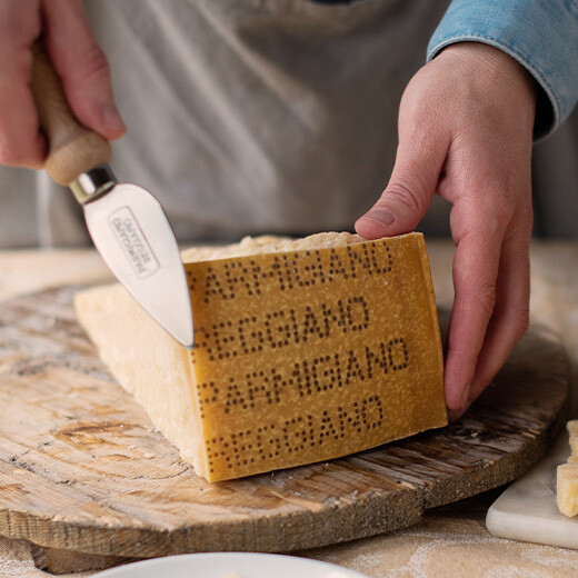
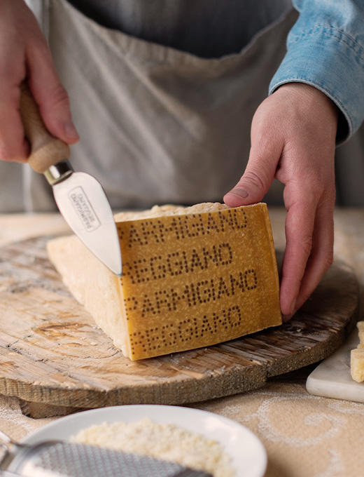
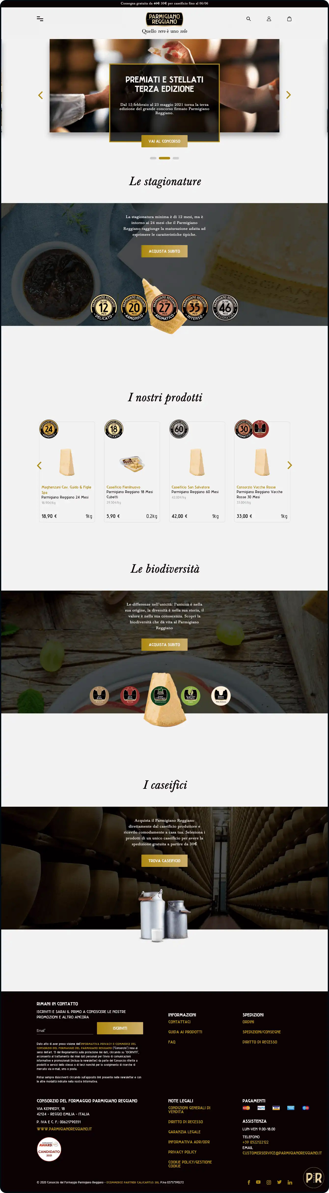
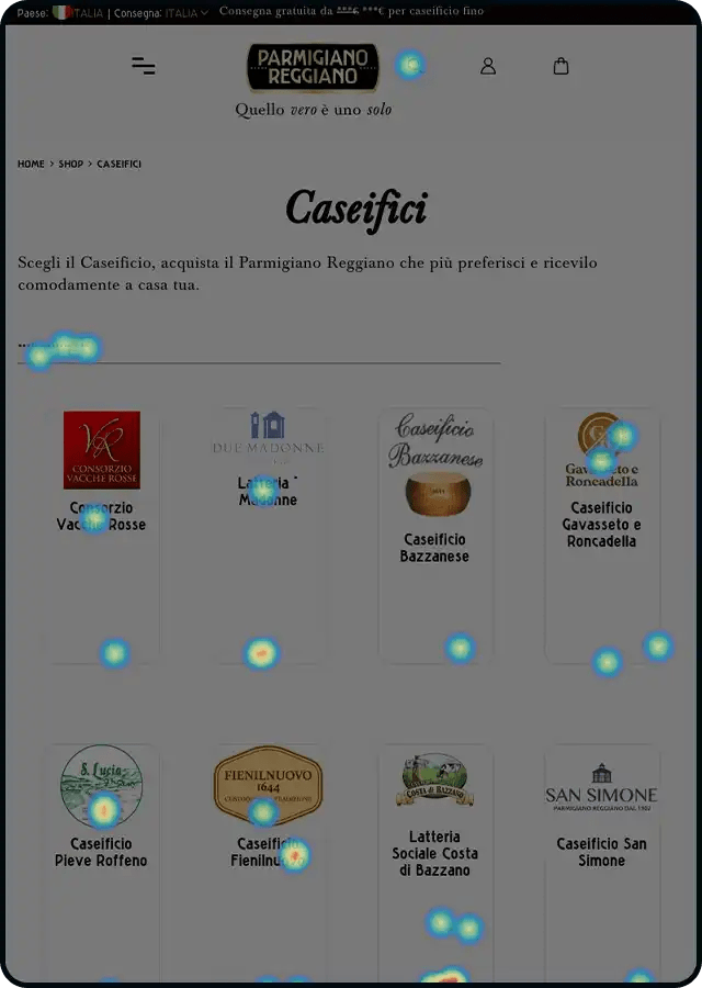
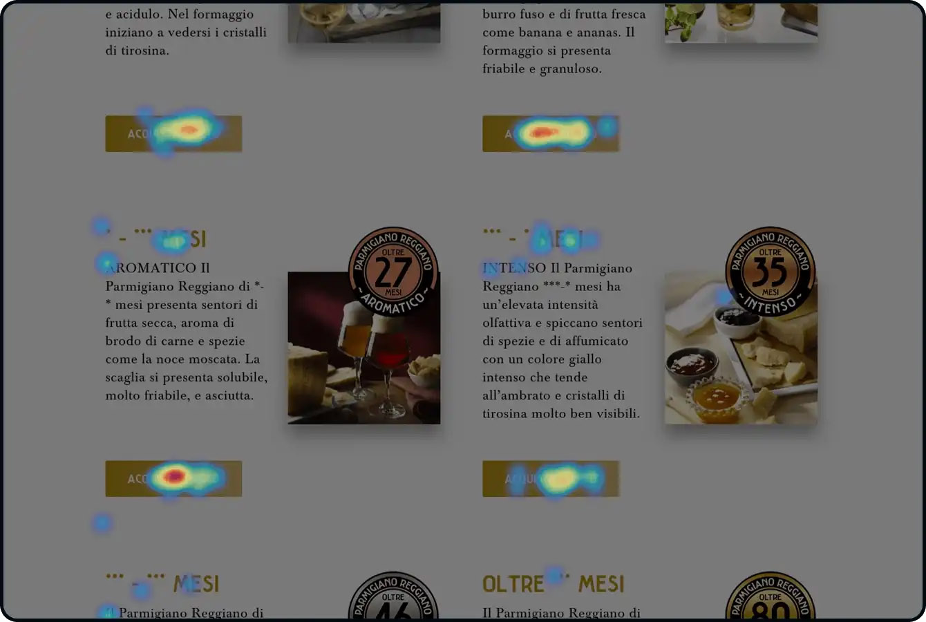
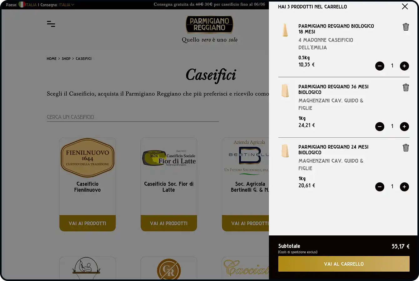
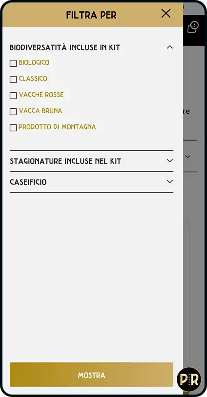
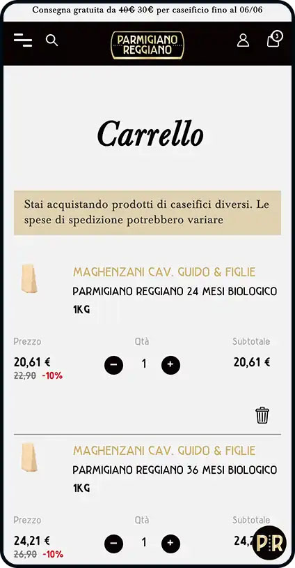
In July 2020, the Parmigiano Reggiano Cheese Consortium promoted the launch of the first multi-cheese eCommerce: a shop that to date houses more than 30 cheesemakers and is continually growing, offering the end consumer the opportunity to learn about and choose producers and buy from more than 400 varieties of Parmigiano Reggiano, from tips to wheels, divided by seasoning, biodiversity and tasting kits.
A personalized experience serving the end consumer
The main challenge was to offer a unique product, while at the same time featuring many varieties and offered by multiple dairies.
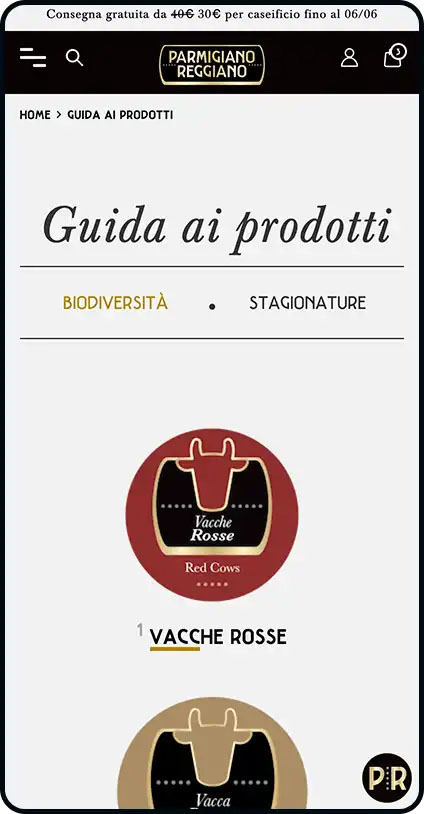
Not only shopping: the shop offers dedicated navigation paths and content based on the stage of the customer journey, which allow the user to discover the dairies, history and products offered, up to in-depth pages on seasoning and biodiversity, which show the user all the variety in the uniqueness of the product.
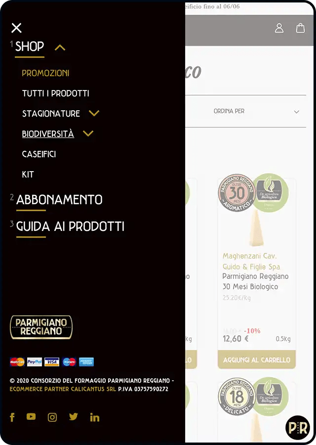
Users who have a favorite dairy can indicate it in their private area or during registration; in this way they personalize their shopping experience by displaying products from the selected dairy in priority in the listing.
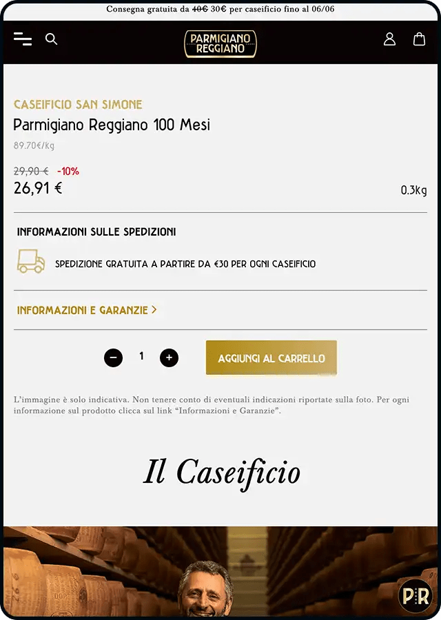
For loyal customers, on the other hand, there is a subscription option: it is possible to subscribe to a dairy and receive selected Parmigiano Reggiano products as often as desired.
From customer onboarding to post-sales communication
Through CRM actions implemented through Hubspot and Selligent, we personalized and enriched the customer experience from the moment of contact acquisition, guiding them through the journey from product knowledge and the world of Parmigiano Reggiano to the post-purchase phase through a series of purpose-built communications to provide useful information on storage and product pairing.
The Loyalty PRogram
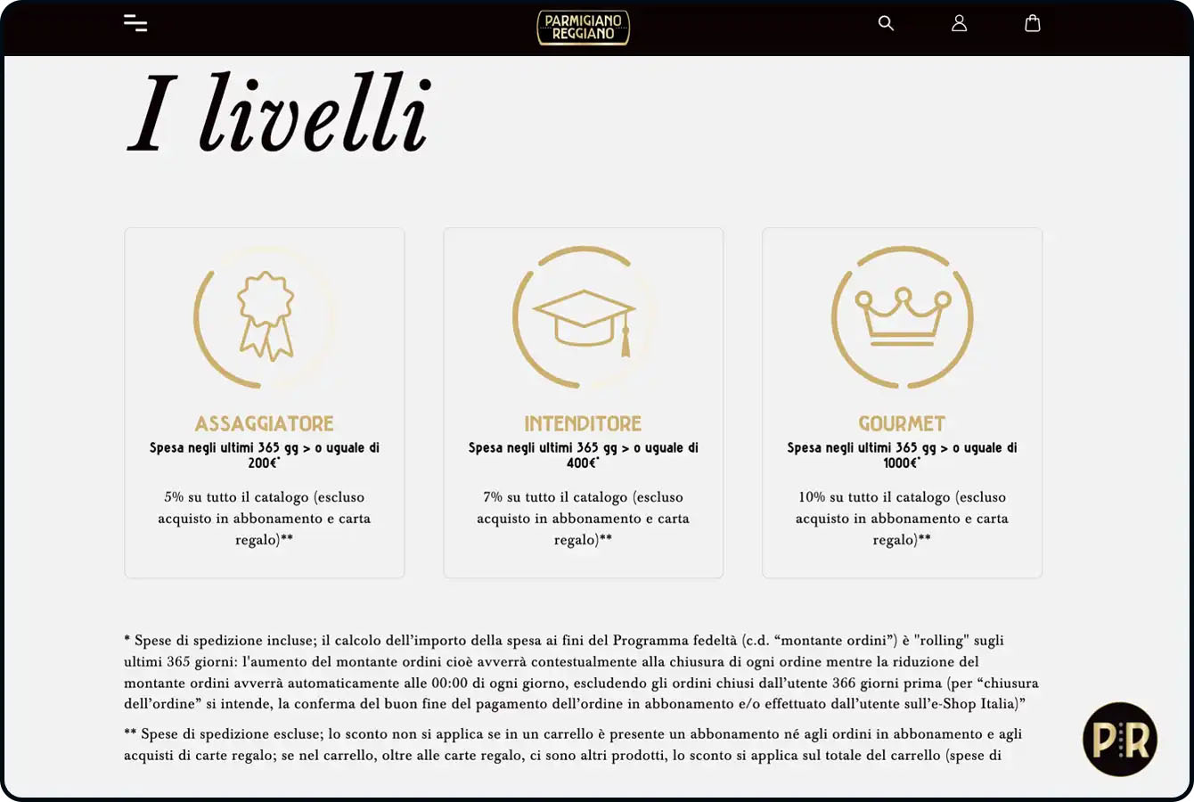
As part of a nurturing-oriented strategy, we launched the Shop Loyalty PRogram that aims to promote customer retention. The system, built on the basis of customers’ buying habits, goes beyond the classic points-to-exhaust model and offers ongoing benefits based on status achieved, working on customer lifetime and incentivizing a long-term relationship.
The shop brings Parmigiano Reggiano to tables around the world
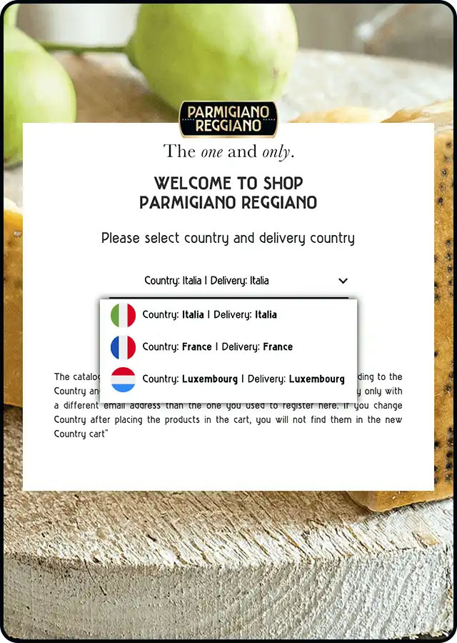
Less than a year after its launch in Italy, the shop arrives in Europe and becomes multilingual: a great opportunity to export the authenticity of a unique product abroad. Two countries are paving the way for the internationalization process of the Parmigiano Reggiano eCommerce, with a view to further expansion.
The institutional website: product, territory and knowledge
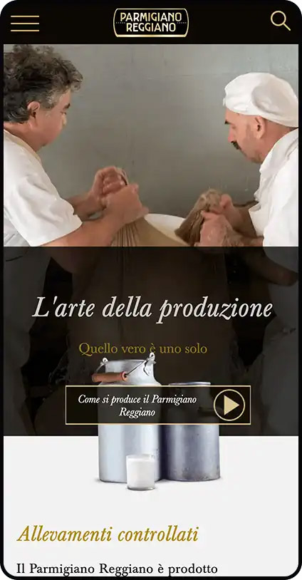
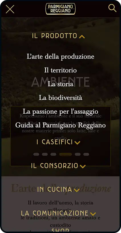
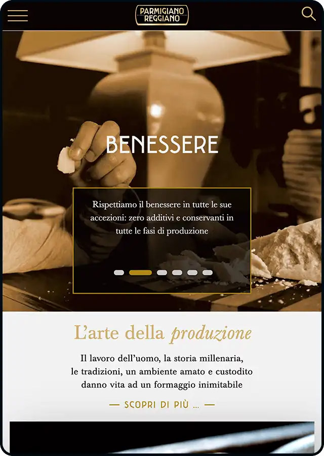
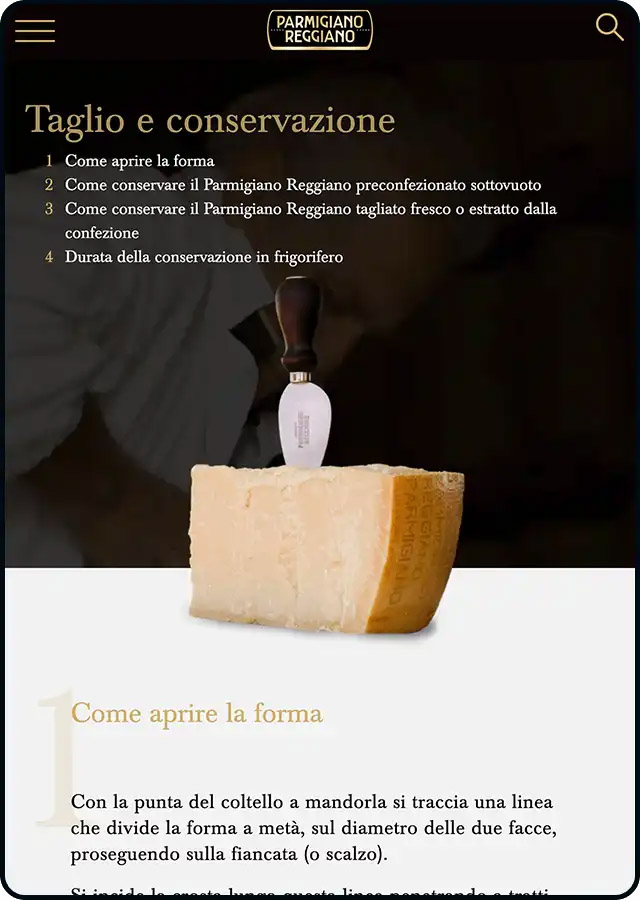
The Consortium’s institutional website provides the user with a range of information related to the product with its guides, technical documents, recipes and all the news from the PR world: the reorganization of the structure has made it possible to group the multiple contents making them easy to use and to give the consumer the freedom to navigate through the sections of the site to learn about everything that constitutes the world of Parmigiano Reggiano.

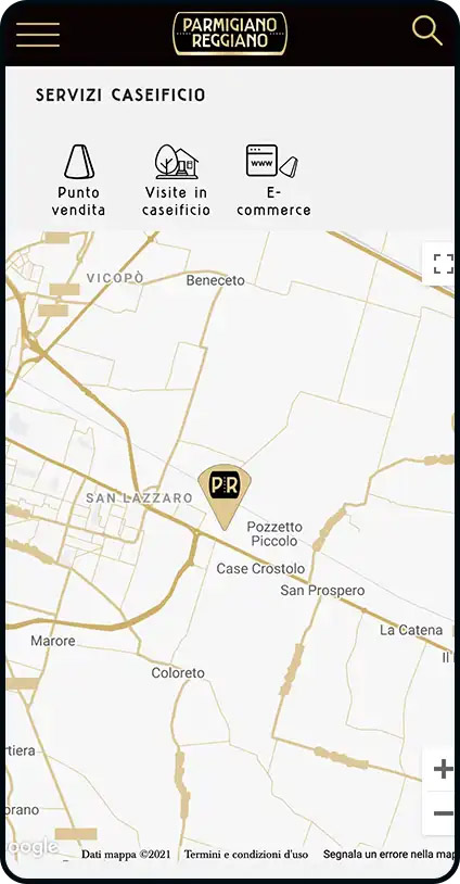
In addition, thanks to the development of a special tool connected with the dairy registry, the user has the opportunity to book a visit to tourist dairies and witness the different stages of the birth of this extraordinary product.
A tool that takes care of animal welfare
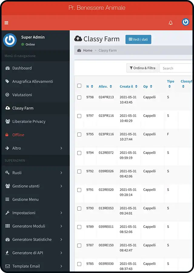
SpotView has developed a web tool to monitor animal welfare: the tool is designed to facilitate the conduct of inspections at the Consortium’s farms, offering inspectors the ability to fill out, through the use of a tablet, checklists provided by the Client and report the data collected through the data visualization tool Google Data Studio, which groups and processes all the reports from hundreds of inspections per year.
Project
Farm Inspection Management
Technology
PHP, Laravel
Year
2019
Projects
Explore the digital products and services we have designed