
Blaco – SpotView case study

A platform that brings B2B and D2C together.
Blaco sells products for hairdressers, beauticians and beauty salons, to professionals and end consumers.
With a growing catalogue, different commercial rules and distinct audiences, it became essential to manage different journeys on the same platform, making content easier to read and helping users find their way.
We designed clearer, guided navigation that showcases the breadth of the range and supports users along the purchase journey.
Three levers, one direction.
Simplifying the user experience while keeping the underlying operational complexity intact.
- Separating B2B and D2C. Journeys tailored to each user's needs, with a common base and no overlap.
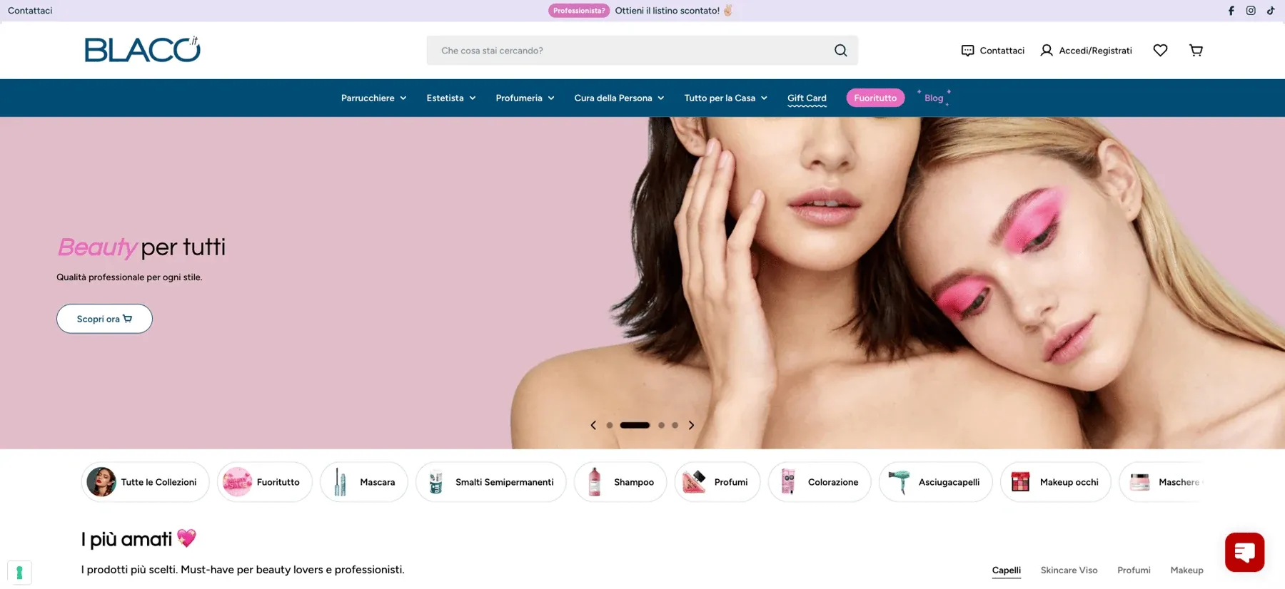
- A cleaner interface. A restyling that redefines visual hierarchy and graphic consistency, so the catalogue is easy to read and explore.
- A transparent checkout. Shipping and payment rules orchestrated dynamically, in a linear, unambiguous flow.
A foundation built to scale.
Shopify Plus made it possible to work on several levels in a coordinated way: a flexible front end and advanced logic for users, markets and purchase conditions.
Working on the checkout and differentiating experiences based on a customer tag turned complex requirements into dynamic behaviour, without fragmented solutions. A platform that is tidier for users and easier for the business to manage.
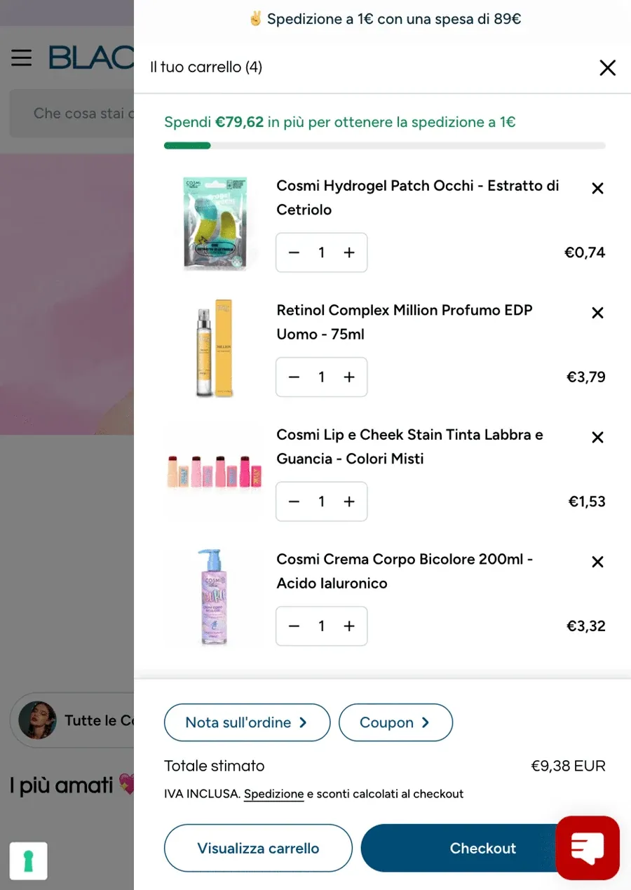
Two experiences, one platform.
Professional and consumer audiences coexist without compromise: the two experiences are separate in content, structure and commercial rules.
- Dedicated B2B access. Logged-in professionals see a tailor-made home page, catalogue and terms.
- A simple D2C journey. End customers get a more direct, discovery-led experience.
- One brand. Visual identity and tone of voice stay aligned across both environments.

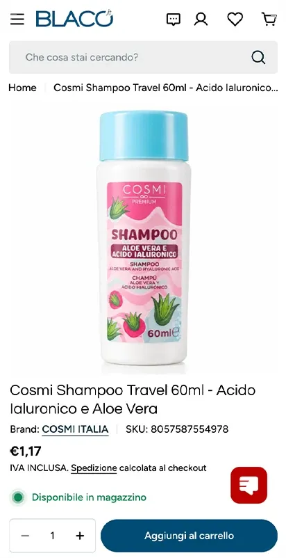
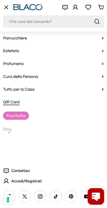
A checkout that adapts in real time.
The checkout combines different rules for shipping, payments and operating conditions. We manage them with a dynamic system based on Checkout Blocks.
- Only relevant options. Depending on the chosen shipping method, the checkout hides incompatible options.
- Remote areas. Dedicated shipping costs and methods, applied transparently.
- Automatic cash on delivery. For premium shipments paid on delivery, the extra cost is added automatically through a dedicated product.
The flow adapts in real time, reducing errors and simplifying every step.
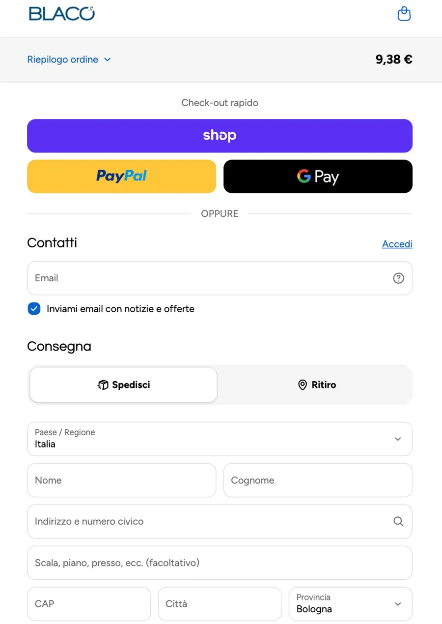
A clearer interface.
Every section showcases the range without overloading the user.
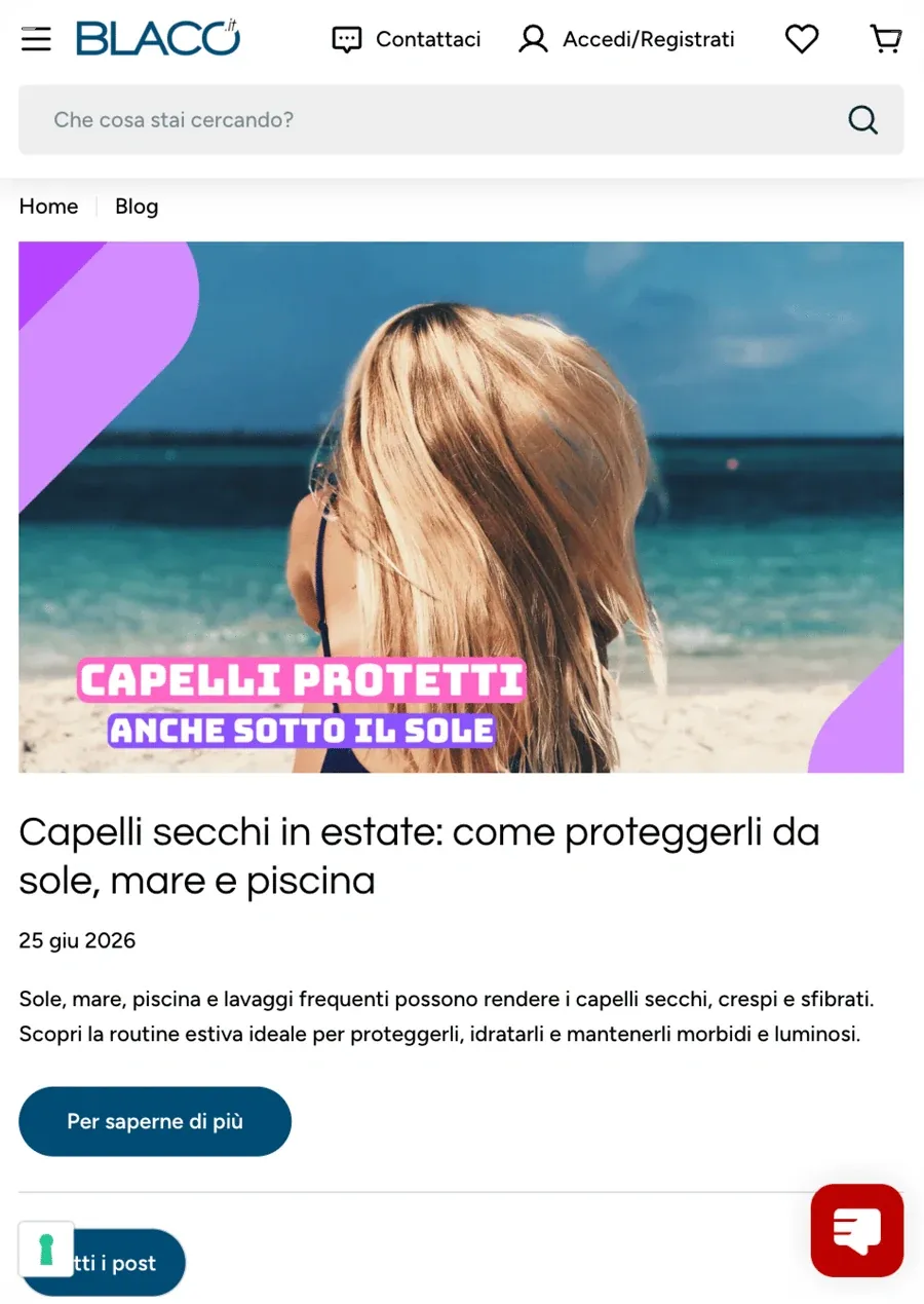
- A reorganised blog. A tidier structure and a visual hierarchy that makes reading easier.
- Gift cards in the spotlight. A more immediate presentation, with the native features of Shopify Plus.
The new platform handles operational complexity without passing it on to the user, improving the overall quality of the interaction.
More projects
All projects
 UX/UI DesignShopifyIntegration & AI Automation
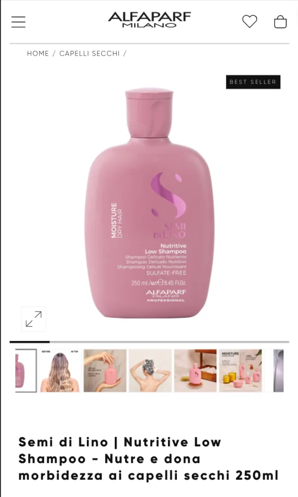
Alfaparf
The Alfaparf world opens up to B2C with Shopify Plus.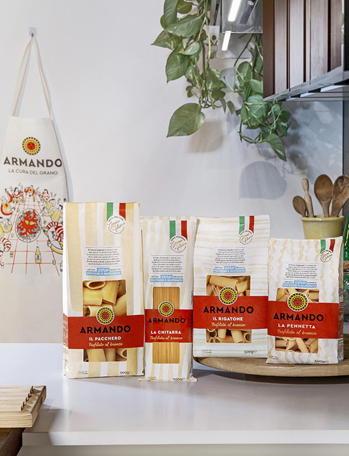
 UX/UI DesignShopifyExperience Management
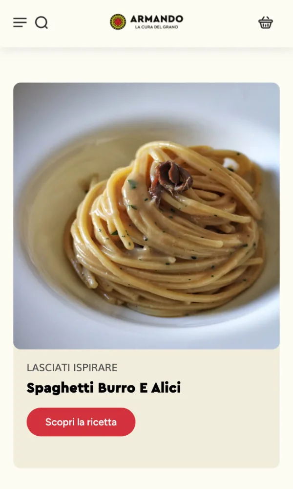
Pasta Armando
Products, recipes and inspiration, all in one place.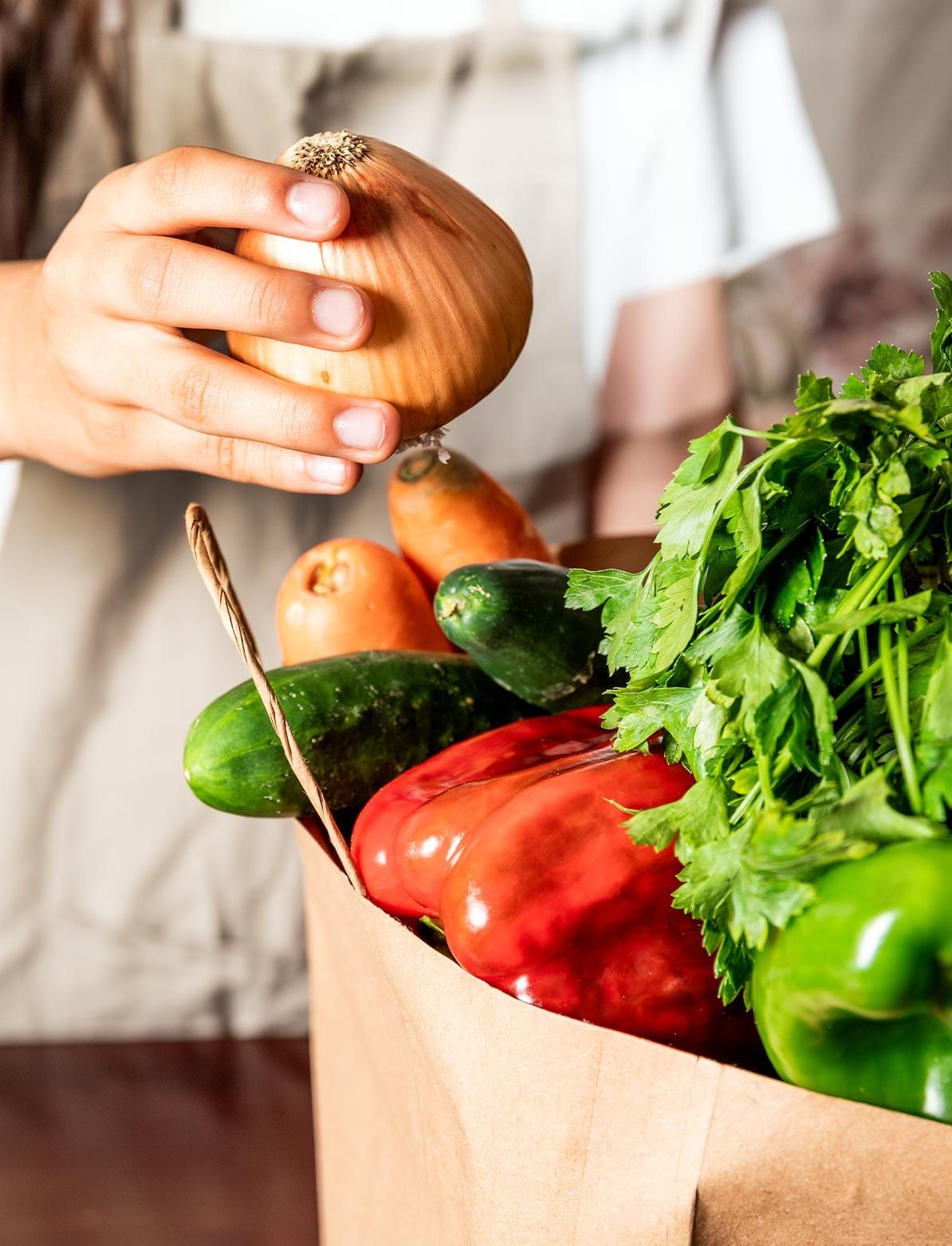
 UX/UI DesignHeadless & ComposableIntegration & AI Automation+1
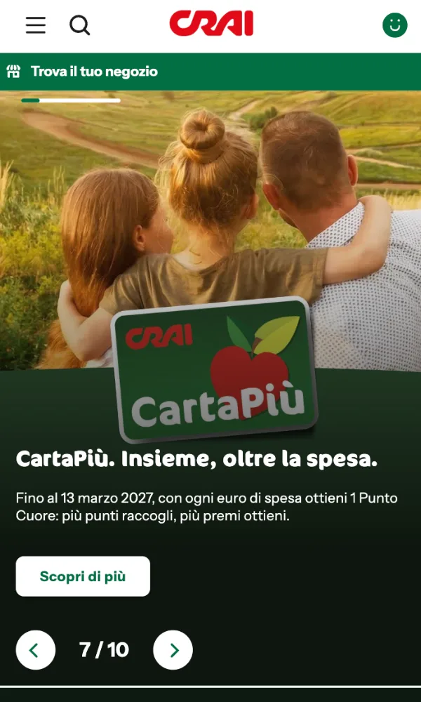
CRAI
A new digital identity for a long-established grocery retail brand.